


37th anniversary.
CI - Introduction.

The CI strengthens the premium corporate image by adding visual elements to SP&G, creating a symbol with blue and green colors that represent eco-friendliness and dynamics.
The blue color of the symbol expresses the creativity and variety of SP&G’s values and the blue sky and green ocean where energy comes from.
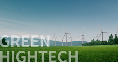
The green color in the middle of the symbol expresses the dynamic life energy of nature, suggesting that SP&G will always pursue green growth with consideration for the environment.
The blue color of the symbol expresses the creativity and variety of SP&G’s values and the blue sky and green ocean where energy comes from.
The green color in the middle of the symbol expresses the dynamic life energy of nature, suggesting that SP&G will always pursue green growth with consideration for the environment.

The letter S of the symbol는
The letter S of the symbol expresses our leadership for Shin Han (New Korea). Based on the assets of Shinhan Machinery and Industry accumulated through challenges and creations, SP&G will become a global leader that creates new values at all times.
The letter P of the symbol는
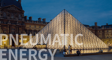
The letter P of the symbol is an abbreviation for the pneumatic energy engineering company, the permanency of the ancient pyramids, the unlimited technologies of the PESSE brand, the best partner that shares its technologies with customers, and the pride of SP&G.
The letter G of the symbol는
The letter G of the symbol expresses green high-tech and green growth. This letter shows our passion for becoming the advanced forerunner of green energy development. From design to architecture and service engineering, SP&G aims to impress future customers and bring happiness by adding a clean environment to the entire process.
■The CI must always be used in its standard form and cannot be altered.
브랜드소개

PESSE심볼은 에스피앤지㈜의 에너지절감사업에 대한 상징물로서 문자에
비주얼 요소를 더하고 컬러를 적용하여 전문브랜드 이미지를 높였습니다.
최고의 공압 에너지 절감 시스템 기술을 통해 압축공기 시스템의 상태진단, 고효율 시스템 제안 및 설계, 관리방법에 n이르기까지 최적의 상태에서 시스템이 유지 될 수 있도록 국내 유일의 ‘One-Stop Service’를 제공하고자 합니다.
최고의 공압 에너지 절감 시스템 기술을 통해 압축공기 시스템의 상태진단, 고효율 시스템 제안 및 설계, 관리방법에 n이르기까지 최적의 상태에서 시스템이 유지 될 수 있도록 국내 유일의 ‘One-Stop Service’를 제공하고자 합니다.

심볼의 삼각형은
이집트 고대 건축 설계의 결정체인 피라미드(Pyramid)의 영구성(Permanency)을 의미합니다.

심볼의 그린컬러는
자연의 역동적인 생명력을 표현한 것으로 에스피앤지가 항상 환경을 배려하며 함께 녹색 성장할 것을 의미합니다.

심볼의문자는 공압 에너지 절감 시스템 기술
(Pneumatic Energy Saving System
Engineering)을 이니셜화 한 것입니다.